Featured Image: Illustration of a computer displaying WebAdvisor and confusion. Hailey Benders | Courtesy
WebAdvisor should be an easy and simple way for students to be able to access important personal and academic information. It is an essential place that students must come back to multiple times, not only during a semester but for the entirety of their time as students attending Virginia Wesleyan University.
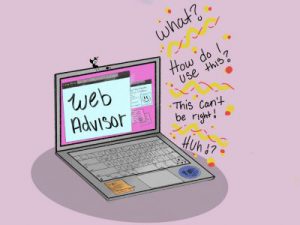
While it is convenient to have many essential matters found in one domain, it can be a little perplexing to utilize it to its full extent in a trouble-free manner.
Sitting front and center of MyBeacon is WebAdvisor, a simple dark blue and white computer icon that matches VWU’s school colors, with its name in a dark shade of gray.
When logging in, which is an issue in itself to be spoken about at a later time, the website’s format tries to follow how early web pages were designed, aside from the top half in scary bold red letters, which would be cute if it weren’t so dull-looking.
WebAdvisor does appear to be organized neatly, but it also feels somewhat clustered in a very compact way. It is almost bothersome with how close the links sit under and over one another when wanting to click on one thing only to be brought to something else.
Certain links always pop up, saying there is an error, and bring you right back to where you started in the menu. Others inconveniently claim that required tasks must be completed to be fully opened.
A good deal of the links include a drop-down menu, which is quite small to begin with, making it more difficult to see.
While registering for classes and/or dropping them, the format can be a little confusing. The names of the classes being linked are especially hard to read because blue words against a blue background seemed like an ill-advised and shortsighted decision to make.
The other main issue is how it can be a little overwhelming to not only pick out classes for the upcoming semester but also how the most important part, the meeting information, is all squished into a small box with little to no space separating them.
The Program Evaluation (Degree Audit) link is a puzzling but key space that is essential to students. Knowing where you stand and making future decisions based on the information shown can be a not-so-fun time if you don’t know how to read what you’re looking at.
Back when I was a first-year, it was briefly explained what the Degree Audit was during a mandatory meeting in a big auditorium, with loads of other students and information being dumped on you at the same time.
Although I understand it much better now that I am in my junior year, I strongly believe improvements should be made, especially in the notes section at the very bottom of the page.
For example, failing to meet the minimum grade requirement is listed as *G. For classes separated into two parts where only one, usually the lecture part, holds the credit, it should not have *G beside the other part of the class, which doesn’t hold credit.
First-years may be the most confused by WebAdvisor as it is new to them. Buckets of information are dumped on them while they are trying to adjust to a new milestone in their lives.
Making adjustments to WebAdvisor can ease the struggle with its current state for students and possibly for advisors. Putting videos out there instead of encouraging students to seek help between classes and outside activities can be a major help when it feels like there’s never enough time in the day.
Samantha Scelta is a junior biology major with an English minor. Sam loves to spend her free time crocheting and playing the piano. She can be contacted at sdscelta@vwu.edu.
By: Samantha Scelta